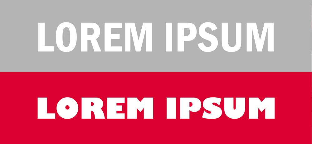
Type - Why bold isn’t always for the best.
“Please make the text bolder…” “Can you make the text wider…” “…Nice bold font please” “Make the text stand out and be bold…” “Strong Bold font…” “…That text is to skinny” “bold, all capitals…”
Just a few comments I have heard while designing a sign for customers. Since technology has taken over and everyone has a computer to write an email or type up a word document; people have developed a tendency to bold the text you want to stand out and make a statement. Makes the words scream off the page.
Bold has an important task on signs to make information standout, however to much bold text on a sign can be distracting and even disruptive to the reading process.
The first rules in any signage are you want it to be readable and legible. Readability refers to the way in which words and block of type are arranged on a page. Legibility refers to how a typeface (font) is designed and how well one individual character can be distinguished from other; defined as the ability to read something without too much effort.
Adding some letter spacing does affect the readability of text, too much or too less can make it unreadable. How much space depends on the distance in which the text is to be read from; what is easy to read an arm distance away to what is easy to read while driving past are two extremes.
So next time you need a sign, ask a designer what’s the best typeface to make it the most readable and legible.


A quick reference guide to design considerations in signage design.