Why colour consistency is critical to business.
Have you ever thought that your logo reproduced on a business card or sign seems to be a bit different to how it looks on screen?
You’re probably right, and here’s our attempt at simplifying why this happens.
When a colour is being reproduced across a range of mediums, such as your PC monitor, TV, brochures, business cards and signs, a conversion takes place so that the appearance is a consistent representation across the board. This process is called Colour Management.
Humans have very good colour vision, being able to distinguish a wide range of colours on the spectrum from bright greens to deep reds, brilliant violets to fluorescent orange. Monitors and printers simply aren’t advanced enough to reproduce this enormous spectrum of colours.
The range of available colours that are available to each is termed the ‘gamut’. The simplified diagram below demonstrates that a monitor (RGB) can’t display all the colours that you can see, and a CMYK printer can only produce a smaller subset of these colours.
““If one says ‘red’ – the name of color – and there are fifty people listening, it can be expected that there will be fifty reds in their minds. And one can be sure that all these reds will be very different.””

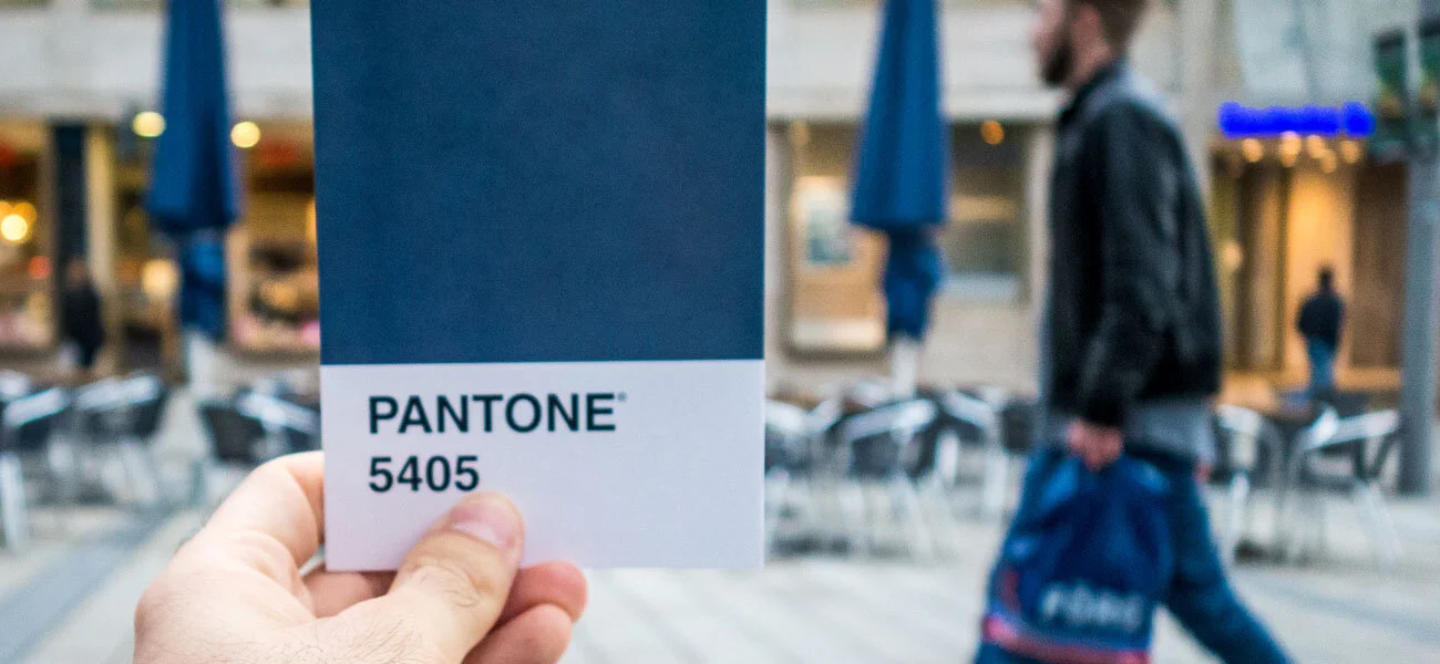
To give a reference point across a range of mediums to how a specific colour should appear, the industry standard is a Pantone Color Bridge. This provides a useful tool for customers to view a physical colour sample, rather than just an on‐screen colour mix. You can see above however that the Pantone range of colours is still wider than a CMYK printer is able to reproduce.
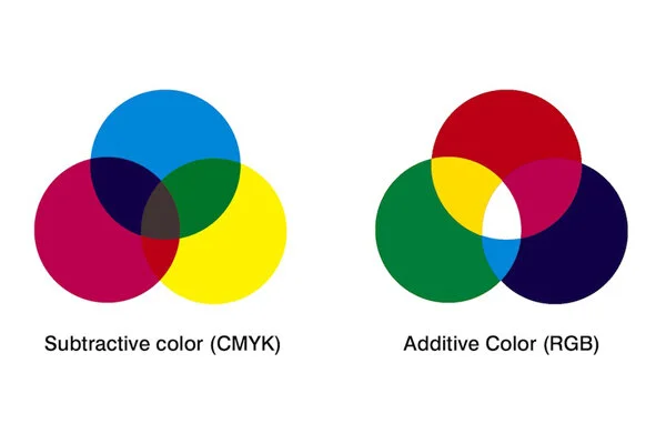
The ways in which colours are produced are very different between a monitor and a printed sample. On a PC or TV monitor, the colours are created in an additive way using RGB elements (typically LED lights). For example, green and red lights illuminate together on a black screen to give a yellow colour. However in a print, colours are created by mixing cyan, magenta, yellow and black (CMYK) inks that absorb or ‘subtract’ light to give a desired colour.
You can see below that yellow and magenta inks mix together to give a red colour.
Delving deeper, monitors of differing types, qualities and ages will produce a different range of colours, and computers will differ in how they specify a colour to be displayed.
Likewise, CMYK printers differ in the type of inks that are used, as do the programs (RIPs) that dictate how a colour will be converted from a specified set of numbers to ink droplets to produce a physical result.
Every media that is printed behaves differently. From papers and cardboards on digital presses, vinyls and textiles on wide‐format printers, each media has a different white point and will absorb inks in a different way.
So to normalise the output ‘profiles’ are created to ensure accurate colour reproduction and to dictate how out‐of‐gamut colours are handled. To add further complication, the colour can even differ slightly between different batches of the same media, ink cartridges and print heads, temperature and humidity in the print environment, and many other factors!


As a customer, there are 2 simple things you can do to ensure you’ve got colour consistency in your branding:
Have a reference point for your branding colours so that anyone reproducing it knows what you expect. Pantone colours are the most accepted reference.
Seek out marketers, designers, printers & sign writers who have a good understanding of these principles and take colour management seriously.
Stuff of interest.


The role of open communications in managing and achieving expectations.